How to navigate better inside the form editor
Experienced sailors know the secret to successfully crossing oceans and seas in their voyage – it’s all about having a smooth navigation.
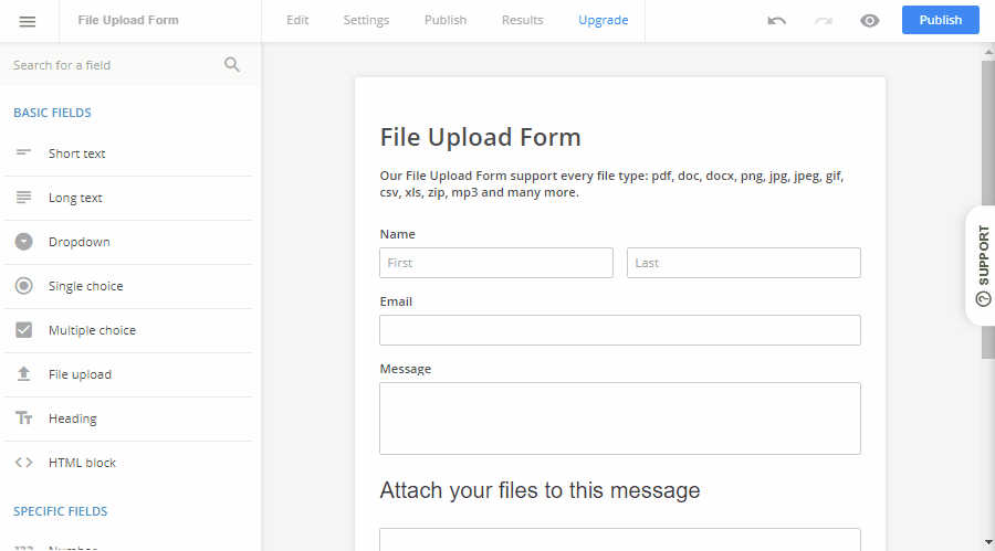
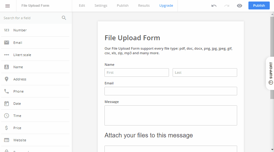
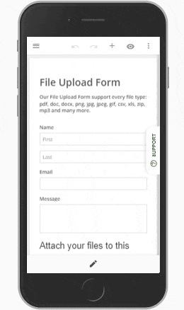
While form building is not as dangerous as passing through stormy seas, navigation still plays an important role when you’re here to build powerful tools for your business. This week we’ve launched a major update aimed at improving the way you can navigate inside the form editor. A new sidebar and a cleaner header that are fully mobile responsive are now live! Check out more details about each one below.
Sidebar navigation
Ask any UX designer today, and he’ll tell you this – sidebar navigation is the cleanest and easiest way to move around a website. We felt that the old way of moving around the different parts of the product wasn’t as consistent as we wanted it to be. That’s why we’ve introduced a new sidebar panel. With it, you can switch between your dashboard, form list and sub users fast. Also, you’ve got links to your account information panel, and to a help button in case you, well…need help with anything.
Better header categories
We wanted to stand by our 1-2-3 form building formula as much as possible, so we took a look at how users are navigating between tabs to optimize the interactions even more. While the new version isn’t that much different visually from the old one, we’ve moved some stuff in the dropdown lists of those tabs.
The Edit tab now includes links to all places that are related to editing your form. You find the Themes part here now, and you can easily switch between the field list and theme editing. Renaming the form can also be done here, as well as undo/redo.
The Settings tab is pretty much the same. You still have a list linking to all the options that you can edit. The Publish tab has everything you need to put your form live, as well as preview the final form.
The new Results tab is something we’ve been thinking of doing for some time now. Before, submissions and reports were separated into 2 different parts, but essentially they represent the same thing – the results you’ve gathered with the form. Now you can access submissions and reports lists through the Results tab. What’s more, the new additions were all made fully mobile responsive
 The changes are being released for a part of our users only, so we can see the effects it has on form building. In case you don’t see them yet, don’t worry – it will be live for you soon.
What do you think of the new navigations options? We’d love to hear some feedback on it, so drop a comment below!


